Have you ever noticed how the way words look can completely change how you feel about them? That’s the magic of lettering. It’s not just about what you say, but also about how you show it. The curves, lines, and little details in each letter shape can whisper elegance, shout boldness, or radiate creativity.
Think about it: the flowing script on a wedding invitation instantly feels romantic. The blocky letters on a street sign feel authoritative and direct. Even your favorite brand logos rely on lettering styles to express who they are.
In this guide, we’ll go deep into the fascinating world of lettering. We’ll explore the classics, the expressive styles, and the modern experimental ones breaking down what makes each special, where they’re used, and how you can make the most of them.
The Classics: Your Everyday Heroes
These are the styles you see almost everywhere. They’re timeless, versatile, and built for clarity.
1. Serif Lettering
Ever flipped through a book or read a newspaper headline and noticed little “feet” at the ends of letters? Those are called serifs. Think of them as the stylish shoes of the lettering world small, decorative strokes that add elegance and readability.
- Features: Classic, traditional, highly readable.
- Best For: Books, newspapers, magazines, brand websites in serious industries (like finance or law).
- Who Uses It: Publishers, law firms, established global brands.
Examples you can follow:
- The New York Times logo uses bold blackletter-style serifs to show authority.
- Times New Roman is one of the most famous serif fonts, once the default in Microsoft Word.
Design Tip: Serif fonts work best in print and long-form content because the “feet” guide the eye smoothly across lines. But don’t use them for tiny digital screens they may lose clarity.
2. Sans-Serif Lettering
Now imagine stripping away those little strokes. That’s sans-serif (literally “without serif”). Clean, modern, and easy on the eyes perfect for the digital age.
- Features: Modern, minimalist, highly versatile.
- Best For: Websites, mobile apps, corporate branding, road signs.
- Who Uses It: Tech companies, designers, modern brands.
Examples for you:
- Google’s logo switched from serif to sans-serif in 2015 to look more friendly and approachable.
- Road signs worldwide use sans-serif for instant readability.
Design Tip: Perfect for headlines, logos, and digital screens. Avoid using overly thin sans-serif fonts for body text they can be hard to read on small devices.
The Expressive Ones: Adding Personality
These lettering styles go beyond clarity. They bring character, emotion, and flair.
3. Script / Cursive Lettering
This style mimics elegant handwriting. Letters often connect in flowing, graceful strokes like a personal signature.
- Features: Elegant, personal, artistic, sophisticated.
- Best For: Wedding invitations, certificates, luxury logos, personal branding.
- Who Uses It: Graphic designers, wedding planners, luxury brands.
Real-World Examples:
- The Coca-Cola logo is one of the most famous script designs ever.
- Luxury brands like Ladurée use cursive to reflect exclusivity.
Design Tip: Use script sparingly. A logo, heading, or signature line is perfect but never entire paragraphs (too hard to read).
4. Monoline Lettering
Imagine drawing every letter with the same consistent pen stroke. That’s monoline lettering sleek, minimal, and modern.
- Features: Simple, clean, uniform thickness.
- Best For: Infographics, tech branding, minimalist logos.
- Who Uses It: Modern startups, architects, designers.
Design Tip: Great for brands that want a futuristic look. Pair with bold colors to avoid feeling too plain.
5. Gothic (Blackletter) Lettering
This dramatic style dates back to medieval manuscripts. Heavy strokes, ornate shapes, and sharp angles make it stand out.
- Features: Historic, bold, intricate, dramatic.
- Best For: Band logos, tattoo designs, themed branding.
- Who Uses It: Artists, musicians, niche brands.
Examples:
- The Washington Post masthead.
- Heavy metal band logos often use blackletter for power and intensity.
Design Tip: Best used in small doses headlines or logos. Too much, and it becomes hard to read.
6. Vintage Lettering
Vintage fonts channel styles from the past from 1920s art deco to 1950s diner signage. They often use textures, ornate lines, and retro charm.
- Features: Nostalgic, detailed, often textured.
- Best For: Retro branding, restaurant menus, packaging, event posters.
- Who Uses It: Food and beverage brands, small businesses, event organizers.
Examples:
- Craft beer packaging often uses vintage lettering to evoke nostalgia.
- Restaurant chalkboard menus with retro flair.
Design Tip: Use vintage lettering when you want to trigger nostalgia. Pair it with muted color palettes (like cream, faded red, or navy blue).
The Contemporary & Artistic Ones: Pushing Boundaries
These lettering styles are bold, experimental, and made to capture attention.
7. Graffiti Lettering
Born on city walls, graffiti lettering is rebellious, colorful, and expressive. Letters often overlap, bend, and explode with energy.
- Features: Bold, dynamic, often colorful, unique shapes.
- Best For: Urban art, youth marketing, album covers.
- Who Uses It: Street artists, edgy brands, youth-focused businesses.
Design Tip: Works best for bold, unconventional brands. If your audience is corporate, avoid this style.
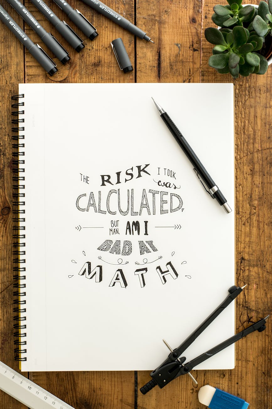
8. Creative Lettering
This is where the rules break. Creative lettering is customized and often hand-drawn, mixing art with letters.
- Features: Highly customizable, illustrative, unique.
- Best For: Posters, book covers, one-of-a-kind logos.
- Who Uses It: Illustrators, artists, boutique brands.
Design Tip: Perfect when you want something bespoke. For example, a café might blend coffee cup illustrations into the lettering of their logo.
The Unique Techniques: Beyond the Basic Shapes
These styles depend more on how they’re made than just the shapes of letters.
9. Brush Lettering
Created with brush pens or paint, this style features thick downstrokes and thin upstrokes. It’s modern calligraphy at its finest.
- Features: Hand-crafted, fluid, organic, bouncy.
- Best For: Social media posts, wedding signage, handmade branding.
- Who Uses It: Calligraphers, DIY artists, small businesses.
Tools You Can Try: Tombow Dual Brush Pens, Pentel Fude Touch.
10. Dimensional (3D) Lettering
Here, letters jump off the page with depth and shading. Think movie titles or game logos.
- Features: Depth, realistic shadows, eye-catching.
- Best For: Posters, advertisements, game titles, signage.
- Who Uses It: Graphic designers, advertisers, illustrators.
Design Tip: Works brilliantly when you want your message to pop but keep it simple so shadows don’t overwhelm readability.
11. Chalkboard Lettering
Inspired by old-school blackboards, this style uses textured, hand-drawn letters with doodles and banners.
- Features: Rustic, playful, textured.
- Best For: Café menus, wedding boards, boutique signage.
- Who Uses It: Cafés, restaurants, event planners.
Real-World Example: Your local coffee shop with a quirky chalkboard menu.
12. Distressed / Grunge Lettering
This style embraces imperfection letters look rough, scratched, or weathered.
- Features: Worn, textured, edgy, industrial.
- Best For: Streetwear branding, band merch, edgy posters.
- Who Uses It: Alternative brands, musicians, artists.
Design Tip: Use sparingly too much grunge can feel messy instead of stylish.
Quick Comparison: Which Style Should You Use?
Choosing a lettering style isn’t just about what looks nice it’s about aligning visuals with your message, audience, and context. Here’s how you can decide:
Classic & Trustworthy → Serif
Serif lettering communicates tradition, authority, and stability. It’s a go-to choice if you want to be taken seriously.
- Best For: Law firms, universities, publishers, financial services.
- Why It Works: Those little “feet” make text easier to read in long paragraphs, which is why books and newspapers often use them.
- Example: The New York Times and Harvard University logos.
Modern & Minimal → Sans-serif
Sans-serif fonts are clean and uncluttered, perfect for digital-first communication. They signal clarity and innovation.
- Best For: Tech startups, corporate brands, lifestyle websites, mobile apps.
- Why It Works: Sans-serif fonts adapt well to different screen sizes and look professional without being intimidating.
- Example: Google, Airbnb, and Spotify all use sans-serif logos.
Elegant & Luxury → Script
Script and cursive fonts give a touch of sophistication, making them perfect for occasions and brands where elegance is key.
- Best For: Wedding invitations, luxury brands, boutique logos.
- Why It Works: Flowing strokes mimic handwritten calligraphy, creating intimacy and class.
- Example: Coca-Cola’s iconic script logo.
Playful & Handmade → Brush or Chalkboard
These styles add personality and warmth. They make people feel like the design is approachable and crafted with care.
- Best For: Cafés, craft brands, event signage, DIY businesses.
- Why It Works: Their imperfect, hand-drawn nature conveys friendliness and creativity.
- Example: Coffee shop chalkboard menus or Etsy seller branding.
Bold & Edgy → Graffiti or Grunge
Perfect for designs that want to stand out and make noise. These styles scream rebellion, energy, and raw emotion.
- Best For: Streetwear, music posters, alternative brands, youth marketing.
- Why It Works: The rugged, bold look demands attention and connects with audiences that value self-expression.
- Example: Metal band logos or urban skate brand designs.
Retro & Nostalgic → Vintage
Vintage lettering evokes memories of the past and adds timeless charm.
- Best For: Restaurants, breweries, nostalgic product packaging, retro events.
- Why It Works: People associate vintage fonts with authenticity, heritage, and craftsmanship.
- Example: Craft beer brands like Brooklyn Brewery use vintage-inspired typography.
Custom & Unique → Creative
When you want something that no one else has, creative lettering is the answer. It’s all about hand-crafted, custom-designed letterforms.
- Best For: Unique logos, posters, book covers, special campaigns.
- Why It Works: No font can replicate a hand-illustrated letter design it feels personal and memorable.
- Example: Hand-lettered posters for music festivals or indie book covers.
Tools & Resources to Explore Lettering
Once you know the style you want, the next step is finding the right tools, fonts, and platforms to bring your vision to life. Here’s a breakdown:
Free Fonts
Perfect for beginners or small projects where budget is tight.
- Google Fonts: Offers a wide range of free, web-safe fonts ideal for websites.
- DaFont: Huge library of creative and decorative fonts. Great for personal projects but always check licensing for commercial use.
Premium Fonts
If you want unique, professional-quality fonts, premium marketplaces are worth it.
- Creative Market: Independent designers sell beautifully crafted fonts here. You’ll find vintage, brush, and script lettering in abundance.
- Envato Elements: Subscription-based access to thousands of fonts and design assets great for designers handling multiple projects.
Lettering Tools (Digital)
For professionals and hobbyists working digitally:
- Adobe Illustrator: Industry standard for vector lettering — scalable designs that never lose quality.
- Procreate (iPad): A favorite for hand-letterers and illustrators, thanks to its brush tools.
- Canva: Beginner-friendly, drag-and-drop tool with a large font library and custom text effects.
DIY Tools (Traditional)
Sometimes the best lettering starts off the screen with pen and paper.
- Brush Pens: Tombow Dual Brush Pens and Pentel Fude Touch are perfect for brush lettering practice.
- Chalk Markers: Great for café menus, wedding signage, or event boards. They give that rustic, handmade feel.
- Sketchbooks & Tracing Paper: Essential for refining hand-lettering before digitizing it.
Pro Tip: Combine Tools for Best Results
- Sketch out your lettering by hand → Scan or photograph it → Refine digitally in Illustrator or Procreate.
- Experiment with mixing free fonts for personal projects and investing in premium ones for professional branding.
Wrapping Up: Your Turn to Experiment
Lettering is more than decoration it’s visual storytelling. The right style can add personality, emotion, and clarity to your message. Whether you’re designing a logo, crafting a wedding invite, or creating a social media post, think about what you want people to feel and then pick the style that delivers it.
Next time you design, ask yourself:
- Do I want to look modern or traditional?
- Should I feel elegant or playful?
- Am I aiming for edgy or friendly?
Your answers will guide you to the perfect lettering style. Unlock your message and let the letters do the talking.